Description: This tutorial teaches you how to create nice looking snow effect on your text, you can use the effect on christmas themed graphics.
To start this tutorial, create a new document and fill the background with a dark color, this is so we can see the snow better, we can change the background color at the end.
Then use your type tool to type in your text.


Select the lasso tool.
Then draw your selections on top of your one of your letter. This will be your snow, so make it look runny/dripping from the top down.


Now create the same type of selection for the rest of your text, but do this by "adding" to the selection. To add to selection, in the selections' menu bar, select the "Add to Selection" button.
This is the most time consuming part for this tutorial, take your time to create some nice dripping selections. If you accidentally make a bad selection, just press CTRL+Z to undo that step.
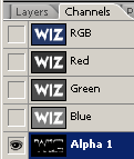
Switch to your Channels pallette (Windows-Channels) then create a new channel by clicking on the "new channel" icon at the bottom of the pallette.
Press "D" to reset your your colors. then select the Paint bucket tool, and fill in the selection with white.


Press CTRL+D to deselect your selection.
Then go to Filter->Blur->Guassian BlurRadius: 3px
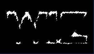
Now go to Image->Adjustments->LevelsMove your levels sliders so the image is sharp and smooth.
Switch back to your layer's pallette, create a new layer.
Go to Select->Load Selection, in the load selection pannel, in the channel field, select Alpha 1.
Then fill in the selection (on the new layer) with white. Now you can press CTRL+D to deselect.
Add some shade to the snow, by adding a bevel emboss style to it.
So go ahead and add "Layer->Layer-Style->Bevel Emboss" to the snow layer.
Now, you can just use your own creativity to add layer styles/background color to your image, but if you want to create what i've done, apply the following layer styles to the original text layer.(note: You may need to adjust a few things with the settings because these settings have different effects depending on the size of the text)


Now create a new layer in between your text layer and snow layer.
Press D to set your foreground color white, then select your brush tool and set the brush size to about 27, and set it's hardness to about 70% (Set this in the "Brush" Pallette)


